
Cover Art Chronicles: There’s Quite a Story Behind Perfect Dark’s Cover Choices

There are undoubtedly good stories behind video game cover art choices for different regions, and why publishers feel specific covers were and are preferable for specific territories. This is the case when, say, western territories receive different covers than those Japan receives, and especially the case when the three biggest regions receive different covers. It’s possible to infer why this happens, usually due to publishers making assumptions about the collective tastes of the gaming audience in certain territories — even if that’s often not the case. But we don’t receive actual testimonies about the decisions that influenced these processes enough.
That’s why the explanations that do manifest are worth treasuring, which recently happened with the covers for the original Perfect Dark on Nintendo 64. When the Rare-developed first-person shooter released in 2000, it arrived with a different cover for each major territory, and the quality between them was far from equal. Each cover features protagonist Joanna Dark in different positions, and though two are comparatively basic examples with fun little stories behind them, one cover was particularly striking. Nintendo Life talked to former Rare Art Director Kev Bayliss, who currently works at Yooka-Laylee-developer Playtonic Games, about why most of the changes were made.
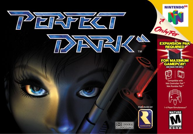
The American and European covers were different, though followed the same pattern. Both feature close-ups of Joanna’s face, though achieve that through different pieces of artwork. The American version was a surprisingly slapdash effort, as Bayliss explained Rare’s need to create a cover quickly, but before a character model was available for them to use. So, Bayliss had to create the eyes and other elements quickly, and complete it within a day. For a box made so fast, it’s not bad. There are several examples of considerably worse box arts designed within a similarly quick timeframe, the most infamous one being the original Mega Man cover — though it’s since become bad in a hilarious way.
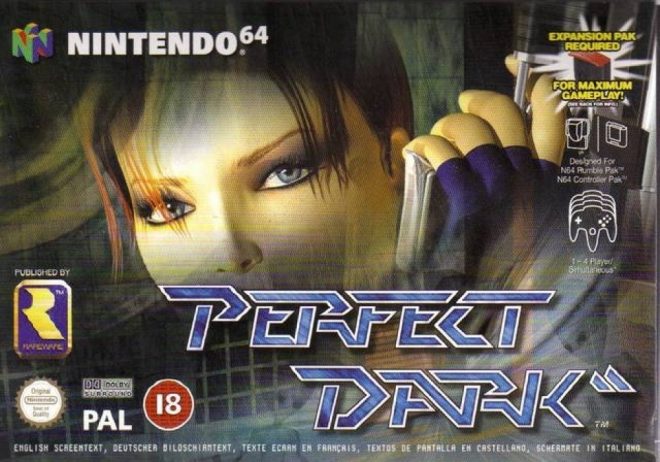
The European version released after the American one, which gave the art designers more time to create the cover. Joanna had a proper character model for this one, used to create a cover in a similar style to the American one. Funnily enough, this is actually the slapdash-looking example since it looks like the designer quickly zoomed in on the face of a character model, highlighted what they wanted, and plastered it onto a futuristic grid background. The American one projects a larger aura of mystery with its closeup, and the blue and red contrast looks good — notably done before the blue and orange contrast became a staple for too many video game covers and especially movie posters (scroll down), a trend still prevalent to this day.
The Japanese cover, however, is in a league of its own. It features Joanna sitting on a couch with her arm and head slouched across the left shoulder, while holding a pistol in her right hand. A sniper rifle also sits on the couch’s right side. The room’s background is covered in red, while the couch, weapons, and Joanna herself are mostly draped in darkness, though some red bounces off her. It’s the kind of perfectly minimalist cover that publishers felt they could only get away with in Japan, and occasionally Europe. It was also an unusual cover for the early 00s, the kind of picture that would be used for an ad or cover for a noir film or novel.
It’s also nice that they didn’t leave Bayliss’ character model out completely, since it still appears on the back cover.
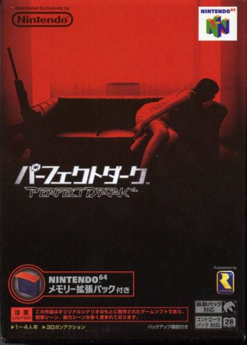
It’s a shame the story behind this art is similarly shrouded in mystery, even for those involved in the game’s development at Rare. Bayliss explained how he hadn’t seen the Japanese cover until spotting it on Rare staffer Simon Farmer’s shelf, but said he really liked it. In fact, he wanted to purchase a Japanese copy in mint condition, but held it off due to moving at the time. He also acknowledged that he loved the idea of having three different box arts for the game.
This is a good story, but we’re still missing details about why Nintendo Co. Ltd (aka Nintendo Japan) decided to go with a different style of box than what their western arms went with, and why this particular style. NCL runs a particularly tight ship, so there’s no guarantee that we’ll ever get an answer about how this cover came to pass, unless a Japanese journalist happens to ask someone who leaves or retires from the company and also happens to remember the Perfect Dark box art. The chances of this or a similar scenario happening are far from good, but here’s hoping someone finds out one way or another.
It would be nice if we received more postmortems about the creations of old game covers. There were several suspect examples during the 8-bit and 16-bit eras with, let’s say, questionable artwork that undoubtedly have fun stories behind why they were chosen. There are also other cases of unique Japanese covers for western games, like how Crackdown (drawn by the now-late Monkey Punch) and Prince of Persia: The Sands of Time received special illustrations for the Japanese releases. Hopefully we get more stories soon.


About The Author
Geoff
News Editor | Geoff is some nerd who writes for a blog and thinks he's knowledgeable. He write a lot about video games, but is capable of writing about other subjects, too. Twitter