Cover Art Chronicles: Final Fantasy XV

Throughout the years, cover artwork for mainline Final Fantasy games have maintained a certain tradition, depending on the region they’ve released in. The Japanese covers tend to be simple and to the point, featuring a logo with accompanying miniature artwork from longtime artist Yoshitaka Amano alongside it. They’re simple in how they’re able to get onlookers to focus on nothing but the title, but also elegant in their subtlety.
Those covers wouldn’t fly in the west, especially in America, since we tend to like our covers busier; or that’s, at least, what marketing directors would have you believe. Ours have historically contained at least one character posing dramatically on them, to try and give the consumer some idea of what kind of game this is. While this can often work well, others are awkward in execution, like the oddly-postured Lighting on Final Fantasy XIII’s western cover.
There are times where traditions are broken, though, and Final Fantasy XV’s covers will mark such an occasion. Considering how different the core game will be compared to even previous installments which made serious changes to the formula, it’s best to have a cover reflecting that. But like everything FFXV-related, there’s vocal dissatisfaction regarding the choices that have been made.
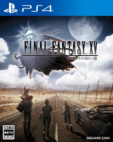
This time, the Japanese cover will reflect one of the game’s key themes, in showing the four main characters gearing up for their road trip. One half is occupied by the long road they’ll be driving down, while the other shows the scenery they’ll venture to in the background, complete with a gigantic full moon in the impending nighttime sky. It sticks out compared to previous Japanese FF covers, but does a nice job letting consumers partly know what they’re in for. From the looks of it, it seems Prompto is ready to get a move on, while the others are too busy strolling and conversing amongst themselves. I like the vibe they went for here, and was hoping they’d stick with this for the western covers.
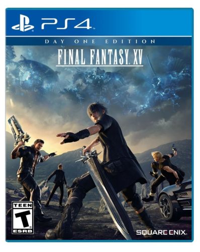
Of course, that wasn’t to be, since it provided nowhere near enough drama. The cover for English-speakers will focus on the game’s combat aspects, though only two characters have weapons drawn. While this maintains the sense of adventure in a different sense, some of the action poses don’t give off the intended “cool” effect. While it’s understandable for each character to have their weapons drawn, due to the impending threat looming in the sky, Noctis’ posture is even more awkward than the aforementioned Lightning’s on FFXIII’s cover. That’s mostly due to the “Stand back ma’am, we’re professionals” position he has with his left hand.
It looks as if they were trying to make the cover more dramatic while also not making it too busy to follow, but the execution is lacking. It’s also strange to see how small the FFXV logo is, which is battling with the “Day One” edition above it for relevance, and it’s lacking Amano’s art — though this admittedly isn’t the first FF game cover this has happened to. It’s a pity they couldn’t stick to the comparative simplicity the Japanese cover provided.
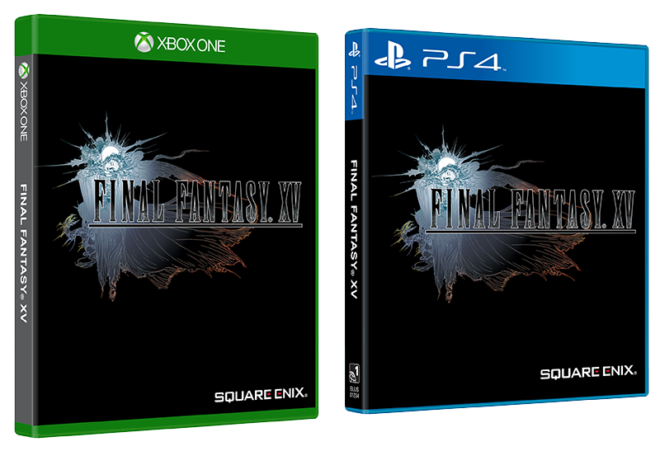
But there’s a nice twist here: Everyone is getting a version that’s simultaneously simple and aesthetically pleasing, in the form of a reversible cover. It seems Square Enix was prepared for the criticisms that would arise from each region’s covers, as the kind of cover I described in the lede (the logo with Amano’s art) will be on the other side. Interestingly, the American version will have a black background, while Europe’s will be white, and both are fitting in their own way. The former matches running theme of the characters’ black outfits, while the latter will adhere to tradition.
Meanwhile, you won’t have to bother with any of the above covers if you’re picking up the Steelbook version coming with the Deluxe and Ultimate Collector’s Editions, which will be adorned with a special piece of artwork featuring the game’s summons from Amano. It’s the same art that was shown at the release date event in late-March. It looks okay (and fits Amano’s tradition of being very busy), but Steelbook packaging should be seen in person to really appreciate it.
I’m always glad whenever companies remember to provide reversible covers, especially third-parties, as they’re capable of satisfying most people who care about admittedly innocuous stuff like this. Personally, I like to see something in addition to the disc when I open a case, considering instruction booklets are a thing of the past outside very few exceptions. It’s a shame not everyone can afford a dual-sided cover, considering how expensive color printing remains, and I assume these costs aren’t entirely swallowed by Sony and Microsoft. I’d like to see Square Enix continue this trend with their titles — for as long as they’re releasing games at retail, anyway.


The sight of the Japanese cover makes me yawn.
The sight of the American cover makes me cock my head in confusion.
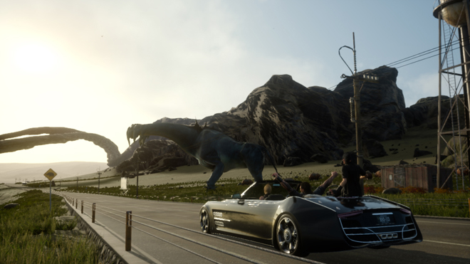
What’s his name? Noctowl? That pose makes absolutely no sense, or, at least, less sense than the overall image: “Let’s get out of our car, miles away from Cloud Man, and draw our weapons. None of our weapons will currently reach him. Draw them anyhow!” Kinda reminds me of the Kid Niki box art that had absolutely nothing to do with what was happening in the game. The final boss was a stone wizard, or whatever. How did he turn into Hoggish Greedly?
I’m honestly not sure how multiple people signed off on that cover with Noctis’ stance, or the small logo. But hey, Square Enix knows how to surprise people in the best and worst ways.